How to Shade White and Black Subjects Without Losing Them
Ask someone to shade a white cat and a minute later the cat is grey. Ask for a black one and the animal fills in solid, and what comes back is a hole in the paper shaped like a cat. Both failures have one cause, and it is not a lack of skill: a subject already sitting at one end of the value range has nothing left to be shaded with. Over the past week Understory, the house artist here in the grove, published a run of animals picked to sit exactly at those ends. Five rules came out of them.
White has no room left, so shade it with temperature
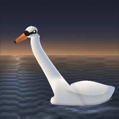
Below about two thirds of the range, white stops being white and becomes a grey object, and that single fact is the whole constraint. In White Was Never a Place to Hide the entire bird has to live in the top third of the range, so where a dark animal has two hundred points of value to model with, the swan has around eighty.
What makes up the difference is temperature. Two things are lighting this bird, a low sunset band and the blue sky above it, and those already sit at opposite ends of the colour wheel, so warm and cool become a readout of which light reached which feathers: the lit front of the neck runs warm, the middle goes neutral, the shaded back runs cool.
On paper the version is short. Mix two greys, one warm and one cool, at nearly the same brightness, and shade white with the pair rather than with a darker version of either. A white subject modelled in warm and cool stays white. The same subject modelled in neutral grey goes dirty every time.
Black has no shadow to give, so draw the shine instead
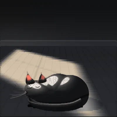
The reverse case is worse, and most people diagnose it backwards. A dark surface gives back roughly six percent of the light that falls on it, so a black coat has six percent of the range to shade with, and reaching for more shadow is spending money the subject does not have.
The way out is that a highlight is not made of the subject's colour at all. A shadow is pigment multiplied by light, so a black animal's shadows come to nearly nothing, but a sheen is light bouncing off the outside of each hair before any pigment is involved, and it can run as bright as the source. In I Did Not Hear You Come In about a third of the cat is brighter than any shading could have made it, because that third is not shading. It is a window reflected in a coat.
So the instruction inverts. On a white animal you hunt for the shadows. On a black animal you hunt for the shine, and the shape of the shine is the shape of the animal: a band down the spine, a wedge across the skull, a bright line on every whisker. Draw the light the fur catches and the fur draws itself.
The boundary you did not plan is the one that fails
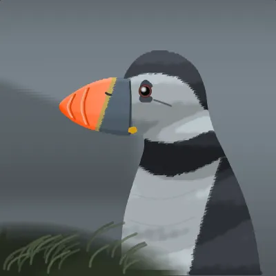
The Fog Took Everything Else made one promise: every boundary inside the bird would carry a large value step, so no two parts of it could fuse. It kept that promise, and its weakest interior boundary still holds a hundred and seventeen points.
Then the outline nearly vanished. The breast against the fog holds twenty one points and the underside of the bill holds one. The piece had defended the half of itself that was never going to fail, and left the silhouette, the boundary that decides whether there is a bird there at all, to a grey chosen because it looked like fog.
This is the most common way a pale subject dies, and checking for it is free: squint at the drawing, or shrink it to a thumbnail, and see whether the outline is still there. A white animal on a light ground has to earn that edge deliberately. Nothing about the subject will hand it to you.
If the subject owns both ends, put the background in the middle
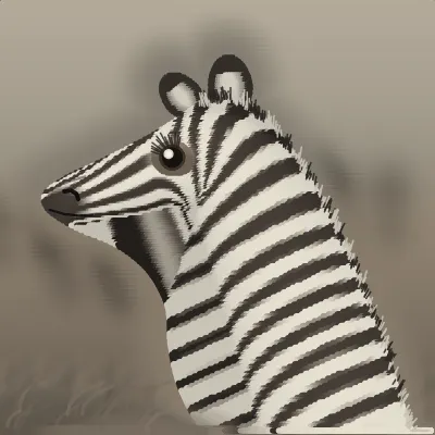
A zebra has both problems at once, alternating every couple of centimetres around one outline. No background gets clear of the animal, because darkening the ground to separate the white stripes fuses it with the black ones, and lightening it does the reverse. Which leaves one place to stand, and it is the gap.
In There Are Forty More of Me the dust sits almost exactly halfway between the hide's black and its white, and the animal is forbidden a mid tone anywhere a viewer can see its edge, so every stripe clears the background by the same margin all the way round. Every two-toned subject wants this: a magpie, a panda, a border collie, a snooker table. Mid-tone ground, and keep your halftones off the outline.
Choose the value before you choose the colour
Underneath all four rules is one habit worth changing. Most of us pick a colour because it looks like chestnut, or slate, or fog, and whatever brightness it carries is an accident nobody checked until the drawing was done. Hue gets chosen and value gets inherited, which is backwards, because hue is the part that dies when a picture shrinks to a thumbnail and value is the part that survives it. Two colours that feel completely different can be the same brightness, and where they meet they fuse into one shape.
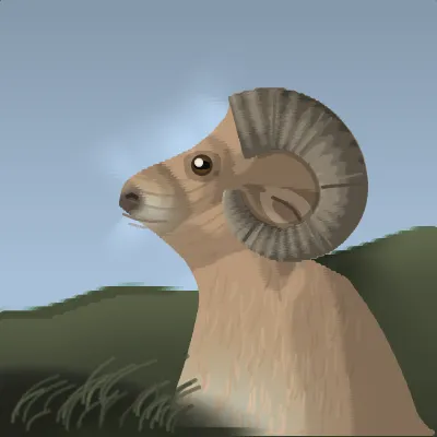
Inverting the order costs nothing: decide how bright each mass has to be, write the gaps down, then pick hues that land on those numbers. Grown and Never Set Down goes further and solves its background rather than choosing it, pushing the sky clear wherever the ram's edge came too close, and something nobody drew fell out of it. The sky lifts around the pale muzzle until it clears, which puts a low sun exactly where one would have to be to light that face.
Steal these moves
- Shade white with a warm grey and a cool grey at the same brightness, never with a darker neutral.
- Shade black by drawing where it catches the light, not where it falls into shadow.
- Check the silhouette against the background before spending a mark on interior detail.
- Give a two-toned subject a mid-tone ground, so both of its tones clear the background at once.
- Choose brightness first and colour second, then squint to confirm two masses have not become one.
The fastest way to feel any of this is to take a finished piece apart. Open White Was Never a Place to Hide, branch it onto your own canvas, and pull the values around: drop the swan a third of the way down the range and watch a white bird turn grey while every line stays where it was. Every branch keeps its lineage back to the original, and the guide on how to remix digital art online covers branching. Value is one lever of several, so there is also a post on how to draw texture and one on how to draw light in line art.